I had been dreaming of a gallery wall for the past few months via the inspiration of, you'll never guess, Pinterest. The beautiful chaos of it all just seemed too good to be true.
 |
| via |
 |
| via |
My project happened with very little planning, which is half the reason I was SO happy that it turned out so well! While spending 12 hours figuring it out as I went was enjoyable (most of the time), documenting the process will hopefully expedite the project for me in the future, and inspire someone else to give it a try! (PS, I apologize that all of these pictures are from my phone, mostly taken at night...)
Supplies:
Frames varying in size, color, style and shape
Measuring tape
Neutral paper (for matting in larger frames)
Command Strip wall adhesives (available at Walmart in the housewares section)
Photos, prints, art
Scissors and tape
Patience! :)
1. Select your wall placement. My favorite wall galleries tend to be over 1 large piece of furniture - I think it helps give a baseline that both features the wall, and does not add to the chaos of it. My preference would have been for it to go over our sectional because it is solid instead of striped, but we weren't about to rearrange the room for this. :)
2. Gather frames. Frame selection and arrangement will be discussed further later on, but at this point, get as many frames as you can for cheap or free. I had accumulated a collection of black and brown frames from high school and college, so I mainly thrifted for silver and gold frames to lighten up the collage a bit. Like I said, the more varied collection of sizes, colors (staying within neutrals, generally), style and shape, the better!
3. Measure the area you'd like to fill. I basically took the length of the couch and the height from the bottom of the light switch to the top of the doorway. I started arranging the collage by measuring this area on the floor, and placing one of the larger frames on the upper left corner of that measurement and the bottom right corner. Once you've marked those corners with your bigger frames, you won't need to measure much more.
4. Arrange your frames... while considering these 3 factors.
4a. Frame color. My frame collection was primarily brown with some black, to which I added silver and gold. In arranging the frames, I tried to evenly disperse the colors by black, brown, and metallic. Below is the arrangement I started with, followed by what ended up on the wall. :)
4b. Frame content. The concept of a gallery wall is to display various forms of art, but I used primarily photographs of us since we've been married. That being said, I tried to use only the better quality photos taken a) by us with our good camera, or b) by our photographer friends. I had 3 main events that I tried to disperse evenly as well: wedding, traveling, and photo shoot. In addition to those I had 2 mirrors, and 3 printables.
I tried to arrange in pairs, but not sections. The goal was to have two wedding photos near each other, but not all wedding photos in one area of the collage.
In selecting which photos to print for which frames, I sat down with my computer and post-it notes, scrolled through our few selected events and chose my favorites for specific frames. (Having the sticky notes was nice when I needed to rearrange things a bit.)
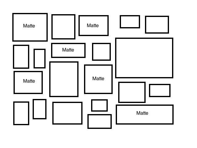
4c. Matting. Not filling the entire large frames with the photo really helps the wall to not feel too heavy or dark. Some of the frames came with a matte, but most of them I simply taped the picture onto paper that I had cut/combined to be the size of the frame. Again, try to disperse those evenly, if you don't do all matted photos.
5. Take the plunge and hang them up! Instead of using nails, I would HIGHLY recommend using wall adhesives. (Can you imagine having to plan where all of those nails go??) Michael has been a huge supporter of the Command Strips for keeping our walls in tact as renters, but those things were a lifesaver for this project. The wall adhesives lets you decide where you want your picture as you're putting it on the wall, not guessing as you hammer a nail that it will hopefully hang your picture at the desired height.
It was fun to see the smaller collages within the bigger one once it was finished. Maybe this can serve as a guideline for smaller collages in the future...
Ok, I really do believe that this project was much easier than it looks - much easier than I just made it look! Haha. But feel empowered, you CAN do this. It was a lot of fun figuring it out, and I have loved having it as a focal point in our home.
-K&M


No comments:
Post a Comment